In [1]:
import pandas as pd
import numpy as np
import seaborn as sb
import matplotlib.pyplot as plt
import porekit
%matplotlib inline
Plotting Data
Visualizing the metadata is very useful to get a first look at the nature and quality of the run.
First we need a DataFrame with the meta data. You can make one with
porekit.gather_metadata once, and then load it later from a hdf file
or something similar.
In [2]:
df = pd.read_hdf("../examples/data/ru9_meta.h5", "meta")
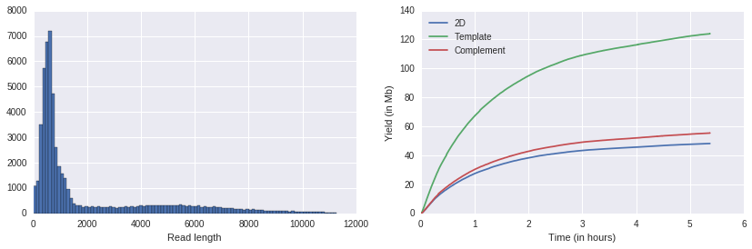
Read length distribution
In [3]:
porekit.plots.read_length_distribution(df);
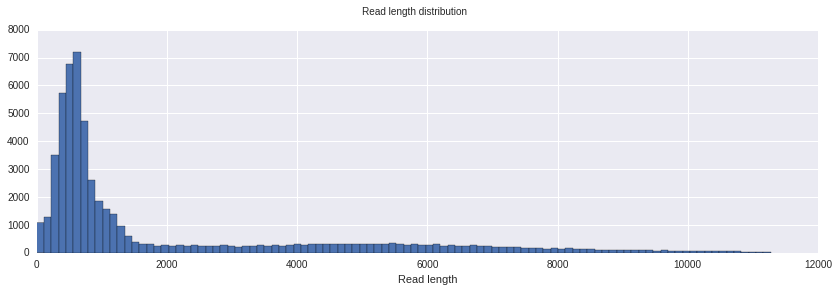
This is a histogram showing the distribution of read length. In this case it’s the max of template and complement length. This plots ignores a small part of the longest reads in order to be more readable.
Yield Curves
In [5]:
porekit.plots.yield_curves(df);
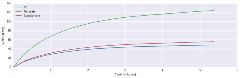
This plot shows the sequence yields in Megabases over time.
Template length vs complement length
In [6]:
porekit.plots.template_vs_complement(df);
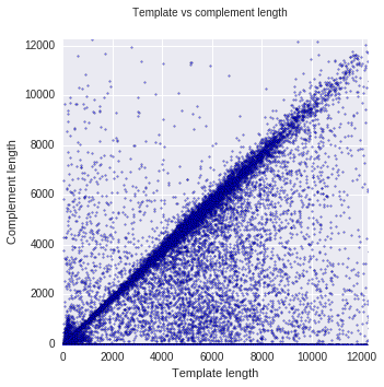
In the standard 2D library preparation, a “hairpin” is attached to one end of double stranded DNA. Then, when the strand goes through the nanopore, first one strand translocates, then the hairpin and finally the complement. Because template and complement both carry the same information, they can be used to improve accuracy of the basecalling.
However, not all molecules have a hairpin attached, not all have a complement strand, and in most cases, the template and complement length does not match completely. This can be seen in the plot above, where most data points are on a diagonal with template and complement length being almost the same. There are more points under the diagonal than above it, and there is a solid line at the bottom, showing reads with no complement.
Occupancy
In [7]:
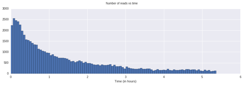
porekit.plots.occupancy(df);
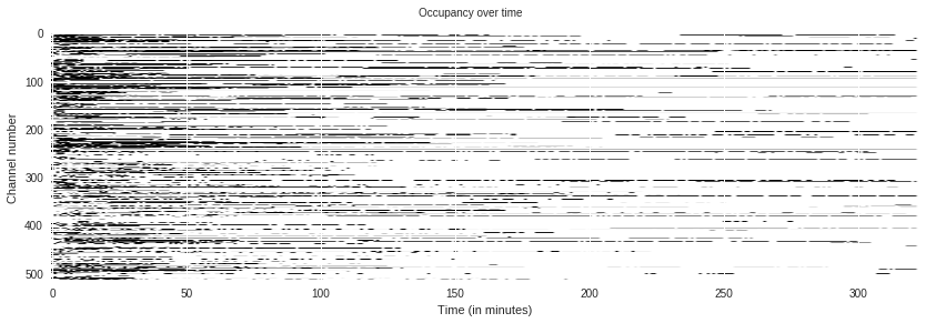
This shows the occupancy of pores over time. In General, pores break over time, which is a major factor in limiting the total yield over the lifetime of a flowcell.
Customizing plots
The plots inside porekit.plots are designed to work best inside the
Jupyter notebook when exploring nanopore data interactively, and showing
nanopore data as published notebooks or presentations. This is why they
use colors and a wide aspect ratio.
But the plots can be customized somewhat using standard matplotlib. Every plot function returns a figure and an axis object:
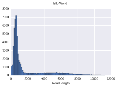
In [8]:
f, ax = porekit.plots.read_length_distribution(df)
f.suptitle("Hello World");
f.set_figwidth(6)
Sometimes you want to subdivide a figure into multiple plots. You can do it like this:
In [9]:
f, axes = plt.subplots(1,2)
f.set_figwidth(14)
ax1, ax2 = axes
porekit.plots.read_length_distribution(df, ax=ax1);
porekit.plots.yield_curves(df, ax=ax2);
If you want to go beyond those relatively simple customizations, you may
want to just copy and paste some code from porekit/plots.py and go
from there. The plots are relatively simple overall.